
What you can style
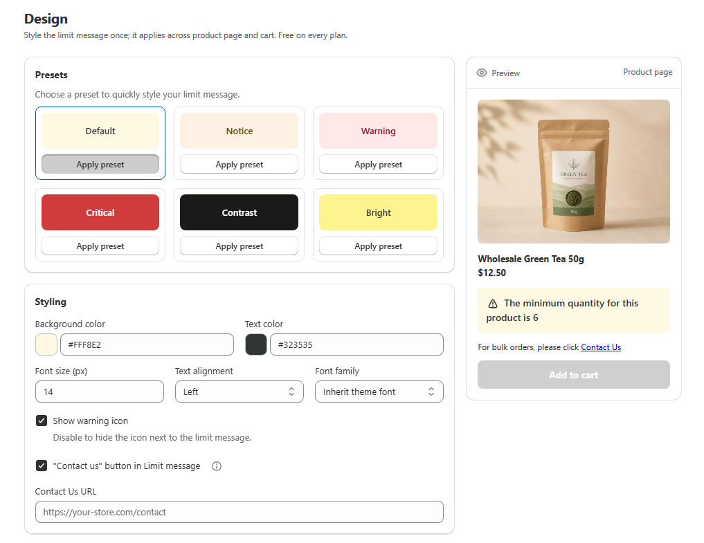
The Design page controls the visual appearance of the limit message on your storefront: one global style, shared by the product page and the cart. Unlike a rule's Messages card, which controls the text per rule and language, Design controls the look for every rule across your whole store.
Setting | Options |
|---|---|
Background colour | Any colour, via the colour picker |
Text colour | Any colour, via the colour picker |
Font size | 10 to 24 pixels |
Text alignment | Left, Center or Right |
Font family | Inherit theme font, Helvetica or Georgia |
Show warning icon | On or off |
"Contact us" button | On or off, plus a Contact Us URL shown once it is on |
Style the message
Open the Design page from the Prime MOQ sidebar.
Start from a preset, optionally. Click a preset in the Presets grid for a ready-made background and text colour combination, or skip to manual styling.
Fine-tune colours, font and icon. In the Styling card, adjust background colour, text colour, font size, alignment, font family, and whether to show the warning icon. Picking a custom colour automatically clears the active preset, since you are no longer using it as-is.
Turn on the "Contact us" link, optionally. Tick "Contact us" button in Limit message to add a link below the message inviting a blocked shopper to reach out instead of abandoning the cart, then enter the destination in the Contact Us URL field that appears. Leave the tickbox off if you do not want the link. There is more on this in Turning a Blocked Order into a Wholesale Lead.
Check the live preview. The right-hand preview card updates instantly as you change settings, showing exactly how the message will render, including the Contact us line if you enabled it.
Save. The new styling applies to every rule's message across your store immediately. You do not style rules individually.
Common mistakes
Styling does not seem to apply. Design only affects appearance, and only shows up once the app embed is active in your theme.
The message is hard to read. Presets are pre-checked for contrast, manual colour combinations are not. Check the live preview before saving a light background with light text.
Wanting different styling per rule. Not supported. Styling is global by design so every limit message looks consistent. Use rule-level Messages if you need different wording.